A thumbnail can look sharp, balanced, and finished in your editor, then lose its hierarchy when reduced to a small feed preview. Fine detail may merge, text may take too long to parse, and the main subject may become difficult to identify. Because YouTube says thumbnails can display differently across devices, reviewing one at reduced size is a useful safeguard before publishing—not a guarantee of more clicks. This five-minute audit asks a narrower question: can a viewer see, recognize, and correctly understand the package when it is small?
Clarity means more than readable text
Before changing a design, separate three viewer tasks that are often treated as one. A thumbnail can succeed at one and fail at another.
Visibility means the design retains a clear hierarchy after reduction. One area should read as more important than the surrounding details, labels, and background elements.
Subject recognition means a viewer can identify the person, object, action, or result at the center of the video without studying every clue.
Premise comprehension concerns the title-thumbnail combination. Together, do they create an accurate expectation of what the video is about? That is a practical interpretation of YouTube’s guidance that titles and thumbnails act as a preview before a viewer chooses to watch. It is not a prediction of clicks or watch time. YouTube’s thumbnail and title guidance provides useful platform context, while the audit focuses on what a viewer can understand before publication.
A two-version scenario reveals different clarity problems
Imagine Maya, a beginner cooking creator, preparing a video about making bread without a stand mixer. Her first thumbnail includes a flour-covered counter, several utensils, a close-up loaf, three text labels, and a small portrait of her holding dough. On a laptop, the composition feels informative. In a reduced preview, the utensils and labels become a busy band, while the portrait and loaf compete for attention.
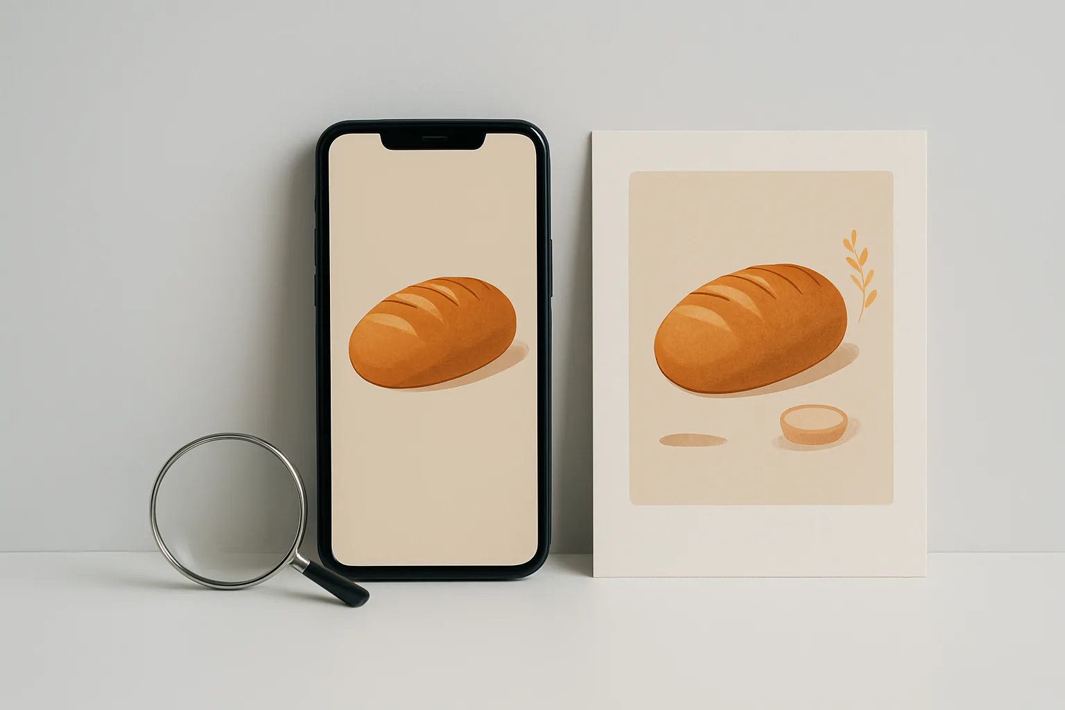
Maya creates a second version by making the loaf dominant, removing the portrait, and keeping one short phrase beside the image. That revision is not automatically more effective, and nothing in this review establishes which version would perform better. It is simply easier to diagnose. The first may lose visibility through crowding; the second may improve subject recognition but still need a title that explains the “without a mixer” premise. Separating the three viewer tasks gives Maya specific design questions instead of a vague feeling that one version “pops” more.
Run the five-minute mobile clarity audit
Use a reduced-size copy or preview of the actual thumbnail. Treat it as a practical approximation, not an exact reproduction of every YouTube placement, screen, or viewing condition. Follow the passes in order: first check what survives reduction, then inspect recognition, and finally review the words and expectation created by the complete package.
Pass one: find the hierarchy that survives reduction
View the thumbnail at a small phone-like size without zooming in to inspect details. YouTube recommends readable fonts and cautions against overly complex designs. Human-factors research points in a similar direction: in brief-viewing conditions, larger text was more legible than smaller text; wider line spacing helped, while crowding and randomly positioned words made reading harder.
Do not turn those findings into a universal pixel measurement or word limit. Ask what remains visible in this design. Is one area clearly dominant, or do several elements compete at the same volume? Does the light-dark separation survive? Can you locate the intended focal area without examining every edge and label? These are observations about the design in front of you, not a rendering standard for every phone.
Pass two: name the subject before decoding the details
Look at the small preview briefly, then describe the subject in plain language. “A loaf of bread,” “a broken camera,” or “a person comparing two laptops” is more useful than “it looks professional.” If your description depends on reading tiny text or examining background clues, the subject may not be carrying enough of the design’s meaning.
Next, consider the relationship between the subject and its surroundings. Fine photographic detail can disappear when compressed, while a background that seemed atmospheric at full size can become visual noise. The goal is not to remove every secondary element. It is to determine whether the subject remains recognizable without requiring the viewer to decode the entire image.
Pass three: review text, contrast, color, and the title together
Read the overlaid words at the same reduced size. Check their size, spacing, and placement rather than searching for a magic font setting. Text that is technically present but slow to parse is not performing the same communication job as text understood at a glance.
Make a focused contrast pass next. W3C’s contrast guidance identifies light-dark contrast as important for readable text. Its commonly referenced ratios—4.5:1 for normal text and 3:1 for large text, subject to exceptions—apply to relevant text or images of text. They should not be treated as a formal compliance score for an entire photographic thumbnail. Because photographs contain changing tones, check whether each letter remains distinct against its immediate background.
Then ask whether any important meaning depends on hue alone. If removing the color distinction would weaken the meaning or legibility, the design has a color-dependence risk. Color alone is not a reliable basis for legibility for people with color-vision deficiencies. This check identifies a possible barrier; it does not make the thumbnail universally accessible.
Finally, read the title and thumbnail as one package. What does the image show, and what does the title add? If both communicate only a generic idea, the specific premise may remain unclear. If the image implies a result that the title does not support, revise one or the other so the expectation is accurate. This is a clarity judgment, not a performance formula.
Use nearby niche context without copying it
Look at videos your intended audience actually encounters in the same subject area, as YouTube recommends. Compare density, subject scale, contrast, and distinctiveness—not the exact composition or wording. Is your design hard to distinguish because it is unusually quiet, or hard to understand because it contains more competing information than the surrounding packages?
This observation supplies context for a design decision. It does not show that a particular pattern predicts performance, and it is not a reason to imitate another creator.
Ask viewers what they noticed and inferred
If your own reading is uncertain, use a small comprehension check with people who resemble the intended audience. Show the thumbnail and title without explaining the video first. Realistic participants are more useful for this purpose than people who already know your production notes, and usability guidance recommends avoiding prompts that influence the response.
Use open questions such as:
- What did you notice first?
- What do you think this video is about?
- What do you expect to happen or be explained?
- What, if anything, was unclear?
Listen for a gap between the intended message and the viewer’s first reasonable interpretation. If several people independently miss the same subject or premise, that is useful directional evidence for revision. It is not statistically predictive of channel-wide behavior, and a few responses cannot establish how every mobile viewer will react. Keep the questions neutral: asking whether someone understood the “without a mixer” idea supplies the answer you are trying to measure.
Keep visual review separate from later measurement
A reduced-size clarity review is different from technical upload compliance. YouTube recommends a large thumbnail image, supports formats such as JPG and PNG, and recommends a 16:9 ratio for standard videos. Those specifications help prepare an acceptable upload, but they do not establish that a design will remain readable at feed size.
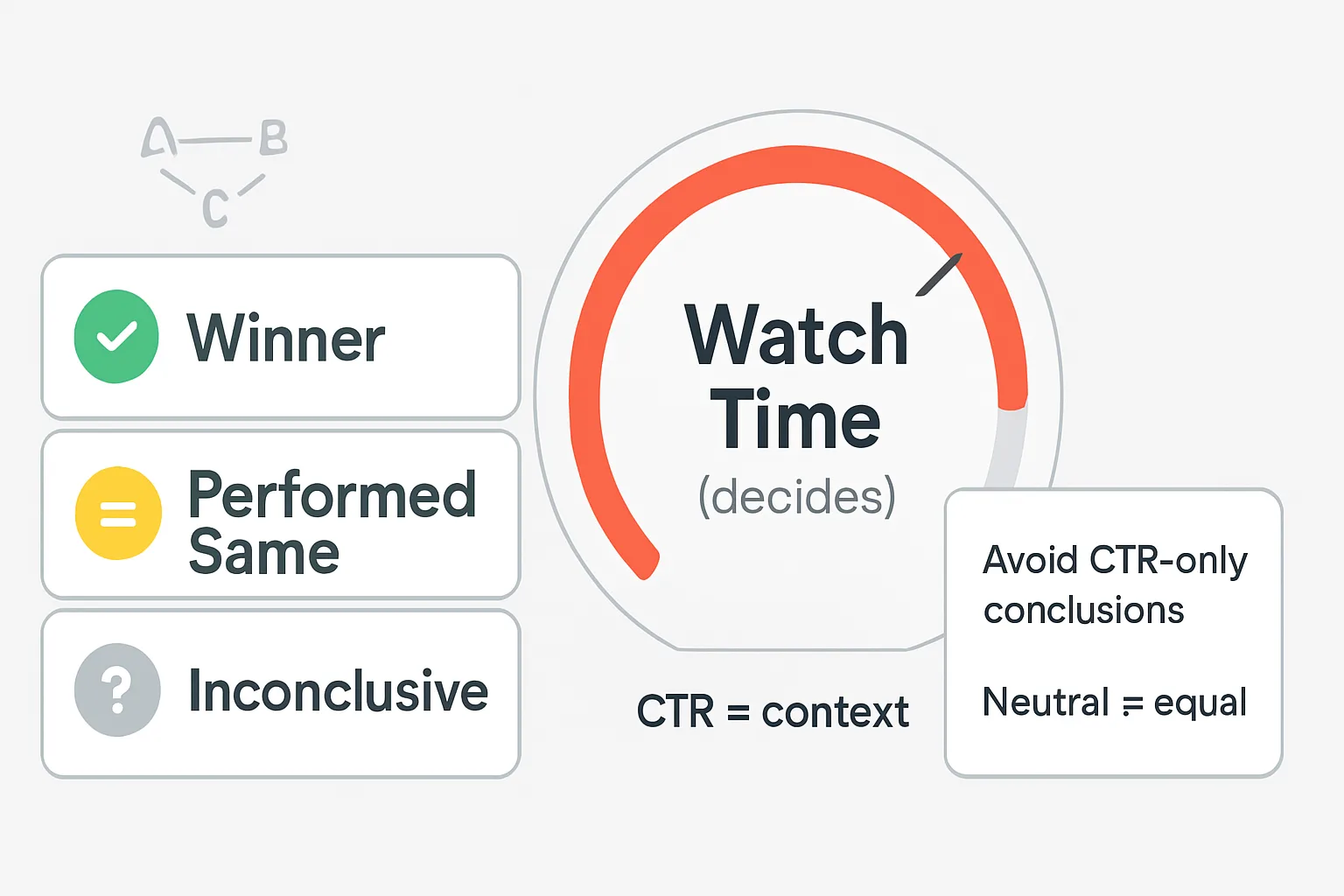
The audit is also separate from YouTube’s post-publication title-and-thumbnail testing feature. The documented feature is available to eligible creators, can test up to three variants, and selects based on watch-time share rather than CTR alone. Tests can be inconclusive when impressions are insufficient or differences between variants are small. YouTube also recommends reviewing title and thumbnail metrics after publication, but those measurements answer a different question from whether someone can understand a small preview.
For that later measurement stage, reading YouTube’s later title-and-thumbnail test results is a separate task from checking pre-publish clarity.
Before publishing, change the clearest observable problem first: a hierarchy that disappears, a subject that cannot be named, text that takes too long to read, contrast that collapses, meaning carried only by color, or a title that leaves the premise inaccurate. Then run the reduced-size review again. The audit cannot reveal eventual performance by itself, but it can support a more disciplined decision about whether the thumbnail’s basic message survives when a viewer sees it small.