A video can show strong average view duration (AVD) or a reassuring retention curve while impressions, total watch time, or continued channel viewing remain limited. That is not proof that YouTube is overlooking a healthy video. First determine which part of the viewing journey is strong and which outcome is actually weak.
When strong viewing does not equal broad reach
“High AVD, low views” places a per-playback measure beside an outcome that depends on how many playbacks occurred and where viewers came from. Someone watching a substantial portion of one upload tells you about that observed viewing session. It does not, by itself, show that the video reached a broad audience, accumulated substantial total watch time, or led to more channel viewing.
Define the problem before interpreting it. Are impressions limited? Is total watch time small because there have been relatively few playbacks? Are viewers watching this upload without measurable continuation through an end screen or playlist? Or does the apparent strength come mainly from one narrow traffic source or format? Each question calls for different evidence.
Separate the viewing metric from the outcome
- Average view duration
- The average amount of video watched per playback, measured in time.
- Average percentage viewed
- The average share of the video watched per playback, expressed as a percentage.
- Watch time
- The total amount of viewing time accumulated within the selected reporting scope.
These metrics answer different questions. AVD may look healthy on a long video while average percentage viewed gives a different picture of the share watched. Watch time, meanwhile, represents viewing accumulated across playbacks, not only the average duration of each one. YouTube’s definitions of these content-performance metrics can help confirm that a comparison uses the same scope and denominator.
Keep the context aligned. Do not compare AVD or average percentage viewed across materially different video lengths, formats, date windows, or traffic mixes as if they were universal scores. Channel-level audience reporting may include videos, Shorts, and live content, so a change in format mix can also affect the apparent audience trend.
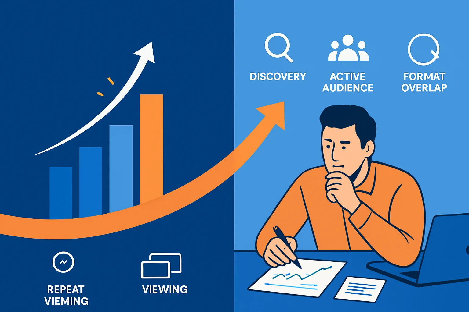
Read reach, audience, retention, and follow-through together
These are parallel evidence branches, not a ranking formula or a guaranteed sequence. Each can narrow the question while leaving the underlying cause unresolved.
Reach and traffic sources
Use the video’s traffic-source report to describe its discovery surfaces. YouTube reports categories including Browse features, Suggested videos, Search, channel pages, playlists, end screens, external sources, and direct or unknown sources. A narrow mix can show where the limited viewing came from, but it does not establish why exposure remained narrow.
Audience mix and retention shape
Read the retention curve for observed patterns such as gradual declines, spikes, dips, or flat sections, then compare available segments such as new versus returning viewers or subscribers versus non-subscribers. New, casual, and regular viewers are behavior-based groups, not proof of audience fit or causality; retention data typically takes one to two days to process. YouTube’s retention-report guidance explains these observations and comparisons.
Downstream viewing and channel follow-through
Check continuation reports without treating them as a complete account of later viewing. End-screen element click rate measures clicks on displayed end-screen elements, while playlist watch time is limited to viewing in playlist context. Returning-viewer patterns add channel-level context, but format mix matters when videos, Shorts, and live content are included. See the definition of end-screen element click rate for its narrower scope.
What the retention curve can—and cannot—tell you
A spike, dip, flat section, or gradual decline is an observation about how viewing changed at a point in the video. It may identify a moment worth reviewing, but the curve alone does not prove whether viewers replayed, skipped, abandoned the video, or responded to a particular editorial choice. Use segment comparisons when available, and avoid turning one shape into a universal explanation.
What audience segments can—and cannot—tell you
New, casual, regular, and returning-viewer labels describe viewing behavior during defined reporting periods. Strong retention among new viewers does not establish that they will return, and a high new-viewer share alone does not establish an audience mismatch. Compare equivalent periods and account for whether the channel’s format mix changed before interpreting a channel-level trend.
Turn the combined pattern into the next question
The useful diagnosis comes from combining the branches without forcing them into one explanation. Consider these hypothetical patterns:
- Strong retention, limited reach, and a narrow external or Search source: ask whether the upload has been observed mainly within that discovery surface. Do not infer from retention alone that broader recommendations should have followed.
- Strong retention among new viewers but little returning-viewer activity: the report shows attention from one audience group without yet showing a repeat channel relationship. Compare equivalent periods and check whether Shorts, live content, and long-form uploads are combined in the audience report.
- A smooth retention curve but little measurable next-viewing activity: viewers may watch much of the selected video without clicking its end-screen elements or generating playlist-context watch time. That does not prove they watched nothing else; it identifies what those reports cannot capture.
- Limited initial reach but follow-through among viewers who arrive: exposure is the weaker observed part of this pathway, while continuation is visible for that group. Keep those findings separate instead of labeling the whole video a success or failure.
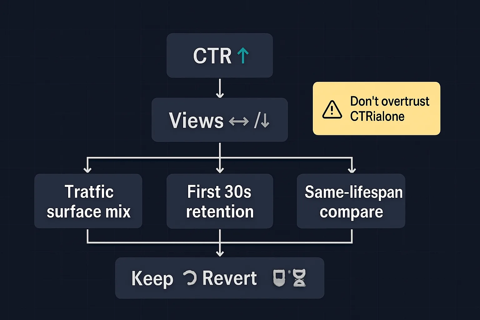
Choose the next question narrowly. A useful comparison might hold format and video length broadly constant, use a comparable date window, examine traffic-source composition, or separate new and returning viewers. The aim is not to find a universal “good” AVD or retention threshold. It is to identify where the evidence becomes thin.
Use a bounded interpretation rule
Read high AVD as evidence about the viewing generated by observed playbacks. Then ask whether the weak outcome is exposure, aggregate scale, audience composition, the shape of attention, or measurable continuation. This is more useful than treating retention as the first and only lever.
Allow recent data to settle before comparing it, and describe reports and questions rather than relying on brittle Studio menu paths. Retention data typically takes one to two days to process, and YouTube’s Studio interface is undergoing a gradual update beginning in July 2026, so exact navigation may vary.
Retention is evidence about observed viewing, not a standalone distribution diagnosis. Once the weak link is clearer, make one defined measurement or content decision and compare it with a suitably aligned period—not with an invented benchmark or a promise that one metric controls reach.